In posters, logos, advertisements and book covers, Glaser’s ideas captured the spirit of the 1960s with a few simple colors and shapes

NEW YORK (AP) — Milton Glaser, the groundbreaking graphic designer who adorned Bob Dylan’s silhouette with psychedelic hair and summed up the feelings for his native New York with “I (HEART) NY,” died Friday, his 91st birthday.
The cause was a stroke and Glaser had also had renal failure, his wife, Shirley Glaser, told The New York Times.
In posters, logos, advertisements and book covers, Glaser’s ideas captured the spirit of the 1960s with a few simple colors and shapes. He was the designer on the team that founded New York magazine with Clay Felker in the late ’60s.
“Around our office, of course, he will forever be one of the small team of men and women that, in the late sixties, yanked New York out of the newspaper morgue and turned it into a great American magazine,” the magazine’s obituary of Glaser said.

Soon city magazines everywhere were sprouting and aping its simple, witty design style. When publishing titan Rupert Murdoch forced Felker and Glaser out of New York magazine in a hostile takeover in 1977, the staff walked out in solidarity with their departing editors, leaving an incomplete issue three days before it was due on newsstands.
“We have brought about — however small — a change in the visual habits of people,” he told The Washington Post in 1969. “Television conditions people to demand imagination.”
But he said he had to work to keep his style fresh.
“There’s an enormous pressure to repeat past successes. That’s a sure death.” Referring to a beloved ’60s design motif, he added that he couldn’t do another rainbow “if my life depended on it.”
His pictorial sense was so profound, and his designs so influential, that his works in later years were preserved by collectors and studied as fine art.
But he preferred not to use the term “art” at all.
“What I’m suggesting is we eliminate the term art and call everything work,” Glaser said in an Associated Press interview in 2000, when the Philadelphia Museum of Art hosted an exhibit on his career. “When it’s really extraordinary and moves it in a certain way, we call it great work. We call it good when it accomplishes a task, and we call it bad when it misses a target.”
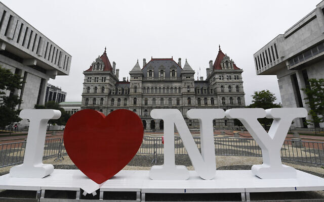
The bold “I (HEART) NY” logo — cleverly using typewriter-style letters as the typeface — was dreamed up as part of an ad campaign begun in 1977 to boost the state’s image when crime and budget troubles dominated the headlines. Glaser did the design free of charge.
Nearly a quarter-century later, just days after the Sept. 11 terror attacks, he revised it, adding a dark scar to the red heart and “more than ever” to the message.
“I woke up Wednesday morning and said, ‘God, I have to do something to respond to this,’” he told The New York Times. “When you have a heart attack, part of your heart dies. When you recover, part of your heart is gone, but the people in your life become much more important, and there is a greater awareness of the value of things.”
Glaser actually had done design work for the restaurants at the destroyed World Trade Center complex.
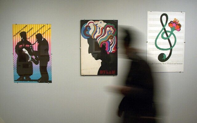
His 1966 illustration of Dylan, his face a simple black silhouette but his hair sprouting in a riot of colors in curvilinear fashion, put in graphic form the 1960s philosophy that letting your hair fly free was a way to free your mind. (For him, though, it wasn’t a drug-inspired image: He said he borrowed from Marcel Duchamp and Islamic art.)

The poster was inserted in Dylan’s “Greatest Hits” album, so it made its way into the hands of millions of fans.
“It was a new use of the poster — a giveaway that was supposed to encourage people to buy the album,” Glaser told The New York Times in 2001. “Then it took on a life of its own, showing up in films, magazines, whatever. It did not die, as such forms of ephemera usually do.”
Among Glaser’s other noteworthy projects were cover illustrations Signet paperback editions of Shakespeare; type designs such as Baby Teeth, first used on the Dylan poster, and Glaser Stencil; and a poster for the Mostly Mozart Festival featuring a colorful Mozart sneezing. His designs also inspired the playbill for Tony Kushner’s “Angels in America”
Glaser was born in 1929 in the Bronx and studied at New York’s Cooper Union art school and in Italy.
In 1954, he co-founded the innovative graphic design firm Push Pin Studios with Seymour Chwast and others. He stayed with it 20 years before founding his own firm.
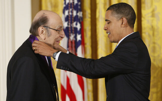
The Cooper-Hewitt, Smithsonian Design Museum awarded him a lifetime achievement award in 2004. In 2009, he was awarded the National Medal of Arts.
“I just like to do everything, and I was always interested in seeing how far I could go in stretching the boundaries,” he said.
As reported by The Times of Israel
